2023 年 6 月 - 新しい CLI、スタイルなど
新しいスタイル、テーマ オプションなどを使用して CLI を完全に書き直しました。
今日は皆さんにお伝えしたい最新情報がたくさんあります。
- 新しい CLI - CLI を最初から書き直しました。コンポーネント、依存関係を追加し、インポート パスを構成できるようになりました。
- テーマ設定 - テーマに CSS 変数を使用するか、Tailwind CSS ユーティリティ クラスを使用するかを選択します。
- ベースカラー - プロジェクトのベースカラーを構成します。これは、コンポーネントのデフォルトのカラー パレットを生成するために使用されます。
- React サーバー コンポーネント - React サーバー コンポーネントの使用をオプトアウトします。 CLI は、
use clientディレクティブを自動的に追加または削除します。 - スタイル - Style と呼ばれる新しいコンセプトを導入します。スタイルには、コンポーネント、アニメーション、アイコンなどの独自のセットが付属しています。
- 終了アニメーション - すべてのコンポーネントに終了アニメーションを追加しました。
- その他の更新 - 新しい
iconボタン サイズ、更新されたsheetコンポーネントなど。 - プロジェクトの更新 - プロジェクトを更新して最新の変更を取得する方法。
新しい CLI
私はここ数週間、新しい CLI の開発に取り組んできました。完全な書き直しです。多くの新機能と改良が加えられています。
init
init コマンドを実行すると、components.json を構成するためのいくつかの質問が表示されます。
Which style would you like to use? › Default
Which color would you like to use as base color? › Slate
Where is your global CSS file? › › app/globals.css
Do you want to use CSS variables for colors? › no / yes
Where is your tailwind.config.js located? › tailwind.config.js
Configure the import alias for components: › @/components
Configure the import alias for utils: › @/lib/utils
Are you using React Server Components? › no / yesこのファイルには、コンポーネントのインストール場所、インポート パス、スタイル設定など、コンポーネントに関するすべての情報が含まれています。
このファイルを使用して、コンポーネントのインポート パスの変更、baseColor の設定、またはスタイル設定方法の変更を行うことができます。
{
"style": "default",
"tailwind": {
"config": "tailwind.config.ts",
"css": "src/app/globals.css",
"baseColor": "zinc",
"cssVariables": true
},
"rsc": false,
"aliases": {
"utils": "~/lib/utils",
"components": "~/components"
}
}これは、src ディレクトリや app ディレクトリを含む任意のディレクトリ構造で CLI を使用できることを意味します。
add
add コマンドの機能が大幅に向上しました。 UI コンポーネントを追加できるようになりましたが、より複雑なコンポーネントをインポートすることもできます (近日公開予定)。
CLI はすべてのコンポーネントと依存関係を自動的に解決し、カスタム構成に基づいてフォーマットし、プロジェクトに追加します。
diff (実験的)
また、アップストリームの更新を追跡できるように、新しい diff コマンドも導入しています。
このコマンドを使用すると、アップストリーム リポジトリで何が変更されたかを確認し、それに応じてプロジェクトを更新できます。
diff コマンドを実行して、更新が利用可能なコンポーネントのリストを取得します。
The following components have updates available:
- button
- /path/to/my-app/components/ui/button.tsx
- toast
- /path/to/my-app/components/ui/use-toast.ts
- /path/to/my-app/components/ui/toaster.tsx次に、diff [component] を実行して変更を確認します。
const alertVariants = cva(
- "relative w-full rounded-lg border",
+ "relative w-full pl-12 rounded-lg border"
)CSS 変数または Tailwind カラーを使用したテーマ設定
テーマに CSS 変数を使用するか、Tailwind CSS ユーティリティ クラスを使用するかを選択できます。
新しいコンポーネントを追加すると、CLI は components.json 構成に基づいて正しいテーマ設定メソッドを自動的に使用します。
ユーティリティ クラス
<div className="bg-zinc-950 dark:bg-white" />テーマ設定にユーティリティ クラスを使用するには、components.json ファイルで tailwind.cssVariables を false に設定します。
{
"tailwind": {
"config": "tailwind.config.js",
"css": "app/globals.css",
"baseColor": "slate",
"cssVariables": false
}
}CSS 変数
<div className="bg-background text-foreground" />テーマに CSS 変数クラスを使用するには、components.json ファイルで tailwind.cssVariables を true に設定します。
{
"tailwind": {
"config": "tailwind.config.js",
"css": "app/globals.css",
"baseColor": "slate",
"cssVariables": true
}
}ベースカラー
これで、プロジェクトの基本色を構成できるようになりました。これは、コンポーネントのデフォルトのカラー パレットを生成するために使用されます。
{
"tailwind": {
"config": "tailwind.config.js",
"css": "app/globals.css",
"baseColor": "zinc",
"cssVariables": false
}
}gray、neutral、slate、stone、または zinc から選択します。
cssVariables を true に設定している場合、基本色は globals.css ファイル内の CSS 変数として設定されます。 cssVariables を false に設定している場合、Tailwind CSS ユーティリティ クラスがコンポーネントにインライン化されます。
React サーバー コンポーネント
React Server Components をサポートしないフレームワークを使用している場合は、rsc を false に設定することでオプトアウトできるようになりました。コンポーネントを追加するときに、use client ディレクティブが自動的に追加または削除されます。
{
"rsc": false
}スタイル
Style と呼ばれる新しいコンセプトを導入します。
スタイルは、図形、アイコン、アニメーション、タイポグラフィなどの視覚的な基盤と考えることができます。 スタイルには、独自のコンポーネント、アニメーション、アイコンなどのセットが付属しています。
default と new-york の 2 つのスタイルを出荷しています (さらに多くのスタイルが近々登場します)。
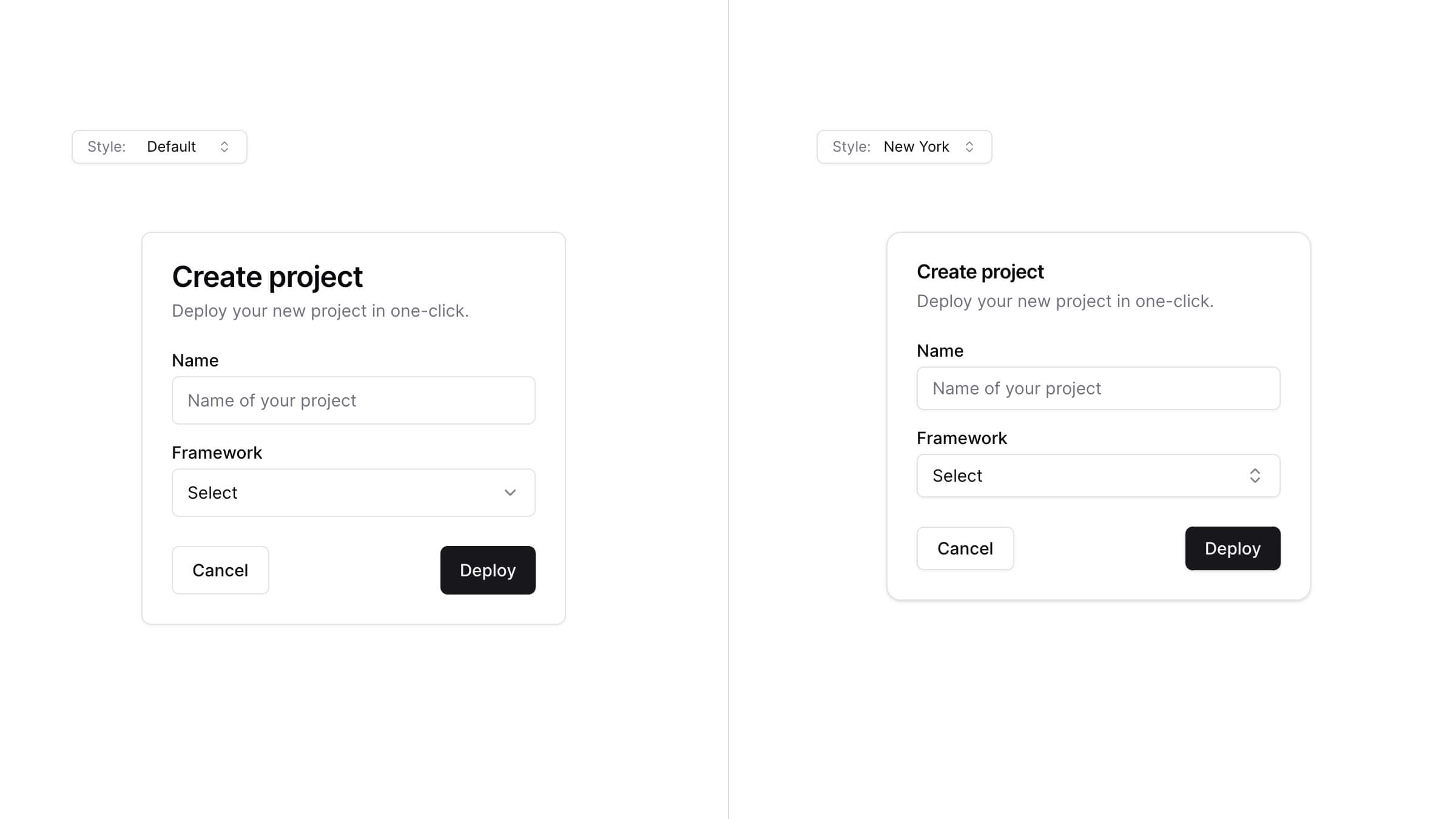
default スタイルは、使い慣れたものです。このプロジェクトの当初から使用しているものです。アイコンには lucide-react を、アニメーションには tailwindcss-animate を使用します。
new-york スタイルは新しいスタイルです。小さいボタン、影付きのカード、Radix Icons の新しいアイコン セットが付属しています。
init コマンドを実行すると、どのスタイルを使用するかを尋ねられます。これは components.json ファイルに保存されます。
{
"style": "new-york"
}テーマ
ベースとしてスタイルから始めて、CSS 変数または Tailwind CSS ユーティリティ クラスを使用してテーマを作成し、コンポーネントの外観を完全に変更します。

終了アニメーション
すべてのコンポーネントに終了アニメーションを追加しました。下のコンボボックスをクリックすると、微妙な終了アニメーションが表示されます。
アニメーションはユーティリティ クラスを使用してカスタマイズできます。
その他のアップデート
ボタン
- 新しいボタン サイズ
iconを追加しました。
シート
- 他の要素と一致するように、名前を
positionからsideに変更しました。
size小道具を削除しました。レスポンシブなサイジングにはclassName="w-[200px] md:w-[450px]"を使用します。
プロジェクトを更新する
コピーアンドペーストのアプローチに従っているため、最新の変更を取得するにはプロジェクトを手動で更新する必要があります。
注: 私たちはあなたを助けるために diff コマンドに取り組んでいます。
アップストリームの更新を追跡します。
components.json を追加
ルートに components.json ファイルを作成します。
{
"style": "default",
"rsc": true,
"tailwind": {
"config": "tailwind.config.js",
"css": "app/globals.css",
"baseColor": "slate",
"cssVariables": true
},
"aliases": {
"components": "@/components",
"utils": "@/lib/utils"
}
}プロジェクト構造に一致するように、tailwind.css および aliases の値を更新します。
ボタン
icon サイズを buttonVariants に追加します。
const buttonVariants = cva({
variants: {
size: {
default: "h-10 px-4 py-2",
sm: "h-9 rounded-md px-3",
lg: "h-11 rounded-md px-8",
icon: "h-10 w-10",
},
},
})シート
sheet.tsxの内容を次のものに置き換えます。
"use client"
import * as React from "react"
import * as SheetPrimitive from "@radix-ui/react-dialog"
import { cva, type VariantProps } from "class-variance-authority"
import { X } from "lucide-react"
import { cn } from "@/lib/utils"
const Sheet = SheetPrimitive.Root
const SheetTrigger = SheetPrimitive.Trigger
const SheetClose = SheetPrimitive.Close
const SheetPortal = ({
className,
...props
}: SheetPrimitive.DialogPortalProps) => (
<SheetPrimitive.Portal className={cn(className)} {...props} />
)
SheetPortal.displayName = SheetPrimitive.Portal.displayName
const SheetOverlay = React.forwardRef<
React.ElementRef<typeof SheetPrimitive.Overlay>,
React.ComponentPropsWithoutRef<typeof SheetPrimitive.Overlay>
>(({ className, ...props }, ref) => (
<SheetPrimitive.Overlay
className={cn(
"fixed inset-0 z-50 bg-background/80 backdrop-blur-sm data-[state=closed]:animate-out data-[state=closed]:fade-out-0 data-[state=open]:animate-in data-[state=open]:fade-in-0",
className
)}
{...props}
ref={ref}
/>
))
SheetOverlay.displayName = SheetPrimitive.Overlay.displayName
const sheetVariants = cva(
"fixed z-50 gap-4 bg-background p-6 shadow-lg transition ease-in-out data-[state=closed]:animate-out data-[state=closed]:duration-300 data-[state=open]:animate-in data-[state=open]:duration-500",
{
variants: {
side: {
top: "inset-x-0 top-0 border-b data-[state=closed]:slide-out-to-top data-[state=open]:slide-in-from-top",
bottom:
"inset-x-0 bottom-0 border-t data-[state=closed]:slide-out-to-bottom data-[state=open]:slide-in-from-bottom",
left: "inset-y-0 left-0 h-full w-3/4 border-r data-[state=closed]:slide-out-to-left data-[state=open]:slide-in-from-left sm:max-w-sm",
right:
"inset-y-0 right-0 h-full w-3/4 border-l data-[state=closed]:slide-out-to-right data-[state=open]:slide-in-from-right sm:max-w-sm",
},
},
defaultVariants: {
side: "right",
},
}
)
interface SheetContentProps
extends React.ComponentPropsWithoutRef<typeof SheetPrimitive.Content>,
VariantProps<typeof sheetVariants> {}
const SheetContent = React.forwardRef<
React.ElementRef<typeof SheetPrimitive.Content>,
SheetContentProps
>(({ side = "right", className, children, ...props }, ref) => (
<SheetPortal>
<SheetOverlay />
<SheetPrimitive.Content
ref={ref}
className={cn(sheetVariants({ side }), className)}
{...props}
>
{children}
<SheetPrimitive.Close className="absolute top-4 right-4 rounded-sm opacity-70 ring-offset-background transition-opacity hover:opacity-100 focus:ring-2 focus:ring-ring focus:ring-offset-2 focus:outline-none disabled:pointer-events-none data-[state=open]:bg-secondary">
<X className="h-4 w-4" />
<span className="sr-only">Close</span>
</SheetPrimitive.Close>
</SheetPrimitive.Content>
</SheetPortal>
))
SheetContent.displayName = SheetPrimitive.Content.displayName
const SheetHeader = ({
className,
...props
}: React.HTMLAttributes<HTMLDivElement>) => (
<div
className={cn(
"flex flex-col space-y-2 text-center sm:text-left",
className
)}
{...props}
/>
)
SheetHeader.displayName = "SheetHeader"
const SheetFooter = ({
className,
...props
}: React.HTMLAttributes<HTMLDivElement>) => (
<div
className={cn(
"flex flex-col-reverse sm:flex-row sm:justify-end sm:space-x-2",
className
)}
{...props}
/>
)
SheetFooter.displayName = "SheetFooter"
const SheetTitle = React.forwardRef<
React.ElementRef<typeof SheetPrimitive.Title>,
React.ComponentPropsWithoutRef<typeof SheetPrimitive.Title>
>(({ className, ...props }, ref) => (
<SheetPrimitive.Title
ref={ref}
className={cn("text-lg font-semibold text-foreground", className)}
{...props}
/>
))
SheetTitle.displayName = SheetPrimitive.Title.displayName
const SheetDescription = React.forwardRef<
React.ElementRef<typeof SheetPrimitive.Description>,
React.ComponentPropsWithoutRef<typeof SheetPrimitive.Description>
>(({ className, ...props }, ref) => (
<SheetPrimitive.Description
ref={ref}
className={cn("text-sm text-muted-foreground", className)}
{...props}
/>
))
SheetDescription.displayName = SheetPrimitive.Description.displayName
export {
Sheet,
SheetTrigger,
SheetClose,
SheetContent,
SheetHeader,
SheetFooter,
SheetTitle,
SheetDescription,
}positionの名前をsideに変更します
- <Sheet position="right" />
+ <Sheet side="right" />ありがとう
このプロジェクトを利用し、フィードバックを提供し、貢献してくださった皆様に感謝いたします。本当に感謝しています。ありがとう。